


Design Strategy & Identity Creation for The Best Looms Project
From the owners of Gallery OED, The Best Looms Project was a completely different offering, their foray into the world of handloom textiles. The Best Looms Project was envisioned to be an exclusive, high value, organic cotton crepe brand. Handwoven on 100 year old looms by generations of weavers and coloured using natural materials, ensuring long lasting colours - this brand was all about the handmade and natural and good for everyone and everything vibe.
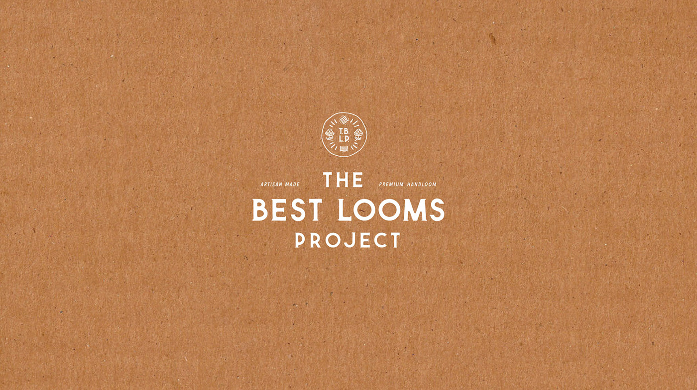
A fluid brand name and identity, at times The Best Looms Project, at times BLOOMS, at times TBLP - the brand had different avatars. But in all avatars it stayed true to its vibe of handcrafted, earthy, no artifice and natural story.
The colours chosen for the brand were also reflecting the same values.
The typography was inspired by handwritten fonts or hand-lettering styles of yore.
The wax stamp inspired insignia also had an imperfection to it that was at the core to the offerings of this brand - beauty that is natural, imperfect and real.

